
“Design a book cover for one of the following:
a.) “To the Lighthouse” by Virginia Wolf: use complementary colours to express anguish and uncertainty.
b.) “The Maiden’s Tale” by Margaret Atwood: use analogous colours with a contrasting accent to express disagreement and discontent.
c.) “The Little Prince” by Antoine de Saint-Exupery: use secondary colours to express naivety, honesty and harmony.
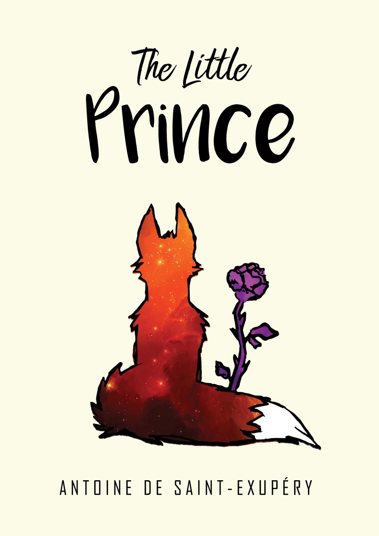
The book cover must contain the title and the author’s name.
You must clearly make use of colour to express the desired effects.”
I chose “The Little Prince” by Antoine de Saint-Exupéry because I found I would have time to read the book before making the cover, thinking it would help me understand the feeling I should try to convey better. I had assumed it was a children’s book, but instead I found that this is a highly reflected and socially criticizing story disguised as a children’s book. It might appear whimsical and naive, but it has a serious and deep subtext. I wanted to reflect this in my design and, perhaps ironically, give the book a more “grown up” look than I had initially planned. I wanted to make people question whether it’s a children’s book or a grown up book just by looking at the cover.
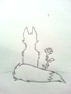
Other than the main characters, the prince and the pilot, I found the fox and the flower to be some of the most impactful characters in the story. Instead of using the obvious characters of the story to illustrate, I wanted to puzzle the reader from the beginning, having the title insinuate that the story is about a prince while the image insinuates that it’s about a flower and a fox. I thought this would apply a mixed message, hopefully leading the reader to think the story will be much more complicated than a children’s book about a prince.
I chose to fill the outlines of the two characters with stars and space to give another hint towards what the story is about. I thought it was a bit symbolic as well, keeping the background of the book simple in one color and adding the detail inside the characters; leaving another hint that the content of the book is more complicated than it seems. The colors also bleed out from the outline so as to symbolize coloring outside the lines.
The font was chosen to give the book that childish feel. The author’s name is in a clear sans font to create the balance between childish and adult.
The main colors are secondary colors (orange and purple) in different tints and shades. I wanted the orange to pop and placed it together with a darker purple so that they wouldn’t compete for attention, but rather create balance and harmony.
The orange is to lure the eye in with a bright color and to give the feeling of the adventure and mystery of a nebula, not just a regular blue/black starry sky. The purple represents royalty, the prince and the darker side of the story.

A very cute cover, I really like how you have use the space effect on the fox 😃
LikeLiked by 1 person
Cute!
LikeLike